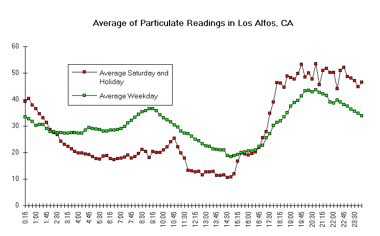
 (Y-axis is Micrograms per Cubic Meter; X-axis is Time
of Day)
The vertical numbers on the left show the density of particles
that are smaller than 2.5. The horizontal numbers are the 15-minute
time averages through out the day. Take your finger and follow
the green line to see how the pollution builds up at night. When
you follow the red line for the weekend, you see the traffic bulge
isn't there in the morning, but by 5:30 PM (17:30) the red line
rises from the lowest level of the week to the highest level of
the week, on the chart. The highest pollution occurs at late night
around 11 PM. Weekends are higher than weekdays.
Here we see time-average curves which are compiled by taking
the data collected over a period of about 3 months in the winter
of 1992-93 and then separating the data into weekdays and Sundays-holidays.
The averages each time period was generated for weekdays and days
that were Sundays or holidays and were plotted in the graph. The
most striking feature from this data is that the shape of the
two curves were very similar. This indicates that the particulate
production could not have been importantly influenced by traffic.
There are no important rush hour peaks on the week ends such as
would be expected on weekdays (Ott). Also the magnitude of the
evening peak is in the Sunday-holiday curve suggesting a recreational
activity such as sitting in front of a fire. Notice how the evening
peak is later on weekdays indicating how the activity waits until
after people arrive home.
from Conference Presentation
Data from the Neighborhood Monitoring above was presented in a
poster session at the Conference on Mortality and Morbidity at
UC Irvine in January 1994. See Abstract: "Real-Time
Monitoring of Airborne Particles" , Mary J. Rozenberg,
Inhalation Toxicology, Taylor & Francais, Bristol, PA, Vol.
7, No.5, July 1995., pg 833
|

